Every comment is a bubble.
popdm pops it.
Bubble wrap, popped.
Creators get flooded with comments, and popdm answers them with the right DM, automatically. Every comment is a bubble on a sheet of bubble wrap. Pop two of the nine and the seven that remain point forward: a message on its way. Those seven bubbles are the logo, and the full sheet of nine is the stage for all the motion.
Comments in. DMs out. You stay in charge.
Seven bubbles and a name.
The logo pairs the seven-bubble mark with “popdm” set in Nunito ExtraBold, all lowercase, so the round letters match the round bubbles. The mark stands as tall as the d’s ascender. On white or any light background the mark is always black. Colour appears on the brand tile and on dark backgrounds.
Versions
Construction
A 3 × 3 sheet of equal bubbles with the middle-left and bottom-middle bubbles popped. The seven that stay make an arrow pointing up and right.
The mark is as tall as the d’s ascender and centred on it. The gap between mark and word is one third of the mark’s width. Lowercase only.
Space, size and backgrounds
Keep at least one bubble’s diameter free on every side of the logo.
Below this size, use the sheet on its own.
Under 24px, always place the mark on the brand tile so the gaps stay open.
Please don’t
Rotate the mark. The arrow always points up and right.
Use the full sheet as the logo. Nine is for motion only.
Use colour on white. On light, it’s black.
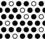
Outline the bubbles. Rings mean “popped”.
Borrow Instagram’s gradient.
Stretch or squash it.
Flip the arrow to point backwards.
Retype or recase the name. It’s always “popdm”.
Three colours to choose from, black and white locked.
Mint, Sun and Bubblegum are the three colour options. Onyx and Pearl are the locked black and white versions. Choose one to re-theme this whole page, every mockup and the download kit.
The one rule
Black bubbles on white and light backgrounds. Colour bubbles on black and dark backgrounds. Ink bubbles on the colour tile. Gradients run from the top left to the bottom right and are only used on the bubbles and the tile. Type is always solid.
Selected palette · Mint
Measured contrast
Round for the name, crisp for the work.
Nunito ExtraBold is the brand voice: the wordmark and big display moments, with round letters that match the bubbles. Geist runs the product UI, body text and data, and Geist Mono labels the details. The name is always written popdm, lowercase.
Twenty ways to pop.
Every animation plays on the full nine-bubble sheet, the stage behind the logo. One SVG switches between all twenty states through data-state. They ship as a React component, a CSS file, animated SVGs in light, dark and on-tile colours, and GIF/WebP for the three hero moments. Everything stops when the viewer has reduced motion turned on.
Rules for motion
Only one sheet animates in view at once. Loops stop when their job is done.
Send means queued, not delivered. Success only plays after the server confirms.
16 to 48px in the product. One-shot states finish within about a second.
Use it in the app
import { PopdmMark } from "./PopdmMark";
<PopdmMark /> // the logo mark
<PopdmMark state="loading" size={24} />
<PopdmMark state="success" key={saveId} /> // re-key to replay
<PopdmMark from="#6AF5C7" to="#14C98C" /> // brand gradient<link rel="stylesheet" href="popdm-motion.css">
<!-- paste popdm-mark-template.svg -->
<svg viewBox="0 0 48 48" data-state="running">…</svg>
el.dataset.state = "send"; // switch statesBubbles to design with.
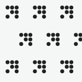
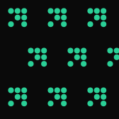
Patterns, dividers, bullets and frames built from the same bubble. Use them for backgrounds, slides, packaging and social posts. They come in light and dark, as tileable SVG.
Every surface, every mode.
The iOS icons are exported full-bleed at 1024px; the system applies the rounded mask. The Android icons are adaptive layers with the sheet inside the safe zone, plus a monochrome layer for themed icons. The favicons are a tiny tile, so the gaps between bubbles stay open at 16px.
<link rel="icon" href="/favicon.ico" sizes="48x48">
<link rel="icon" href="/favicon.svg" type="image/svg+xml">
<link rel="apple-touch-icon" href="/apple-touch-icon.png">
<link rel="manifest" href="/site.webmanifest">
<meta name="theme-color" content="#2EE6A6">The mark does real work.
In the app the bubbles replace spinners, ticks and badges, so every state speaks the same language. These are the patterns to build with.
Press it: the sheet swaps in for a spinner while the request runs, then switches on. The button keeps its width and blocks a second press.
The send state confirms that a DM was queued. It never claims delivery; that waits for Instagram’s confirmation.
The slow breathing wave shows an automation is live but nothing has come in yet.
The lockup sits top left in the web app; the sheet alone in the collapsed sidebar and the mobile tab bar.
The corner bubble pulses on the inbox tab when a comment needs a person.
Bubbles pop along a snake path and refill. Use it in place of any spinner, at 16 to 48px.
Where creators will meet it.
Concept mockups across the places popdm shows up: phones, the inbox, the dashboard, email, Instagram and real-world creator kits. Names and numbers are illustrative.
42 people commented LINK on your reel. Replies are queued.
3 comments need you in Reply Desk.
Automations
Create automationYour automation is live
“Golden hour presets” is now replying to comments with the keyword LINK. We’ll tell you when Instagram accepts each message.
Say LINK.
Get link.
Comment
→ DM
1,000 DMs free.
while
asleep
Everything, ready to ship.
Every file comes from one geometry source, so they always match. Logos are outlined vectors that need no fonts. Switch the palette at the top to download that palette’s kit.
Brand kit v1
Mint
167 files: logos, marks, wordmarks, favicons, iOS, Android and macOS icons, 20 motion states as SVG, GIF/WebP for the hero moments, a React component, brand elements, social images and colour tokens.
Download ZIP · …